Branding, graphics and collaboration designs for Ellie G’s, a New York City small-batch ice cream brand.


Challenge
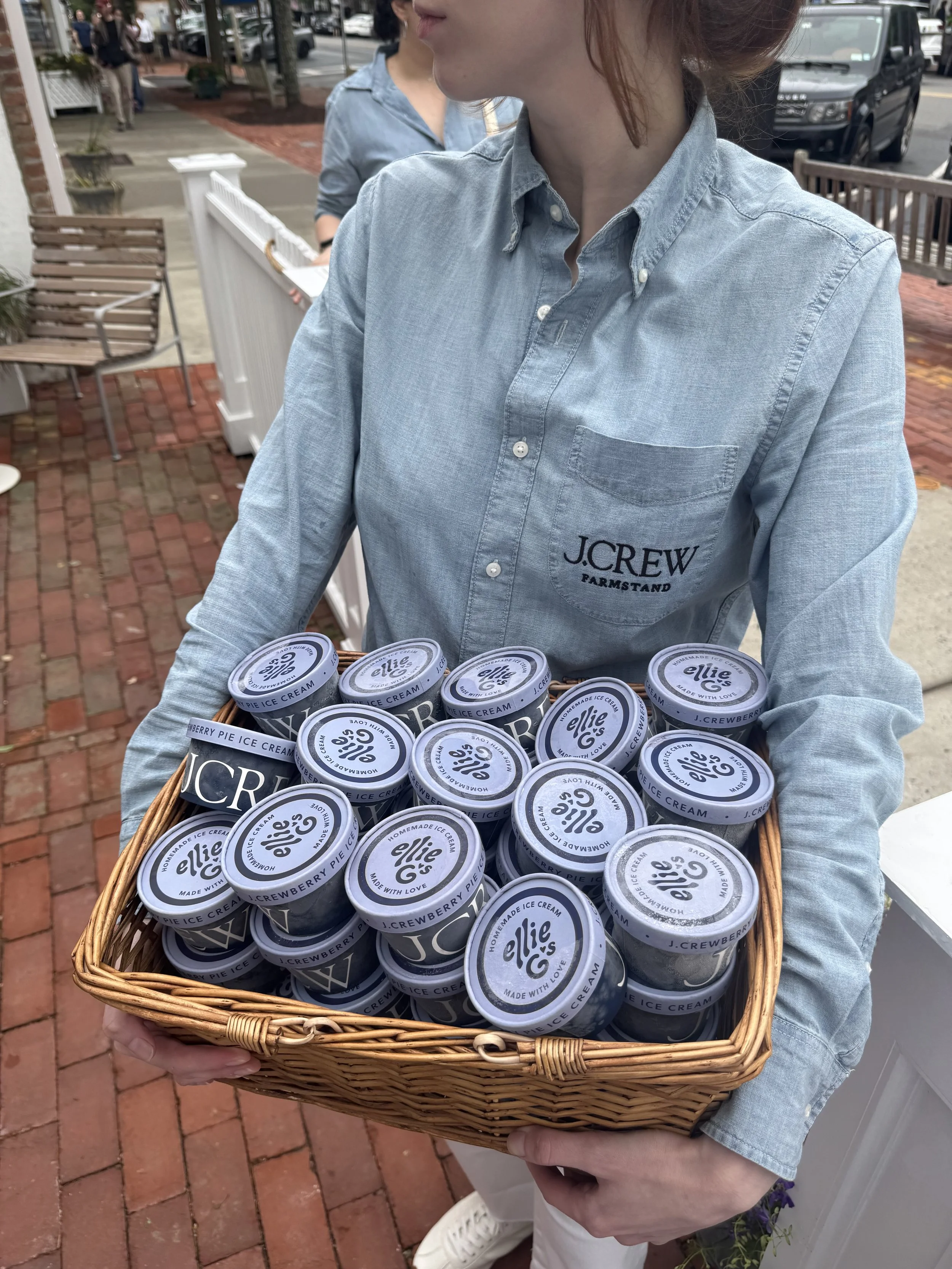
Develop the brand identity for Ellie G's: a locally operated, organic ice cream business rooted in the community of New York, where over 35 pints are sold weekly.

Idea
Represent the two most important principles of the company, “homemade” and “community”.
Solution
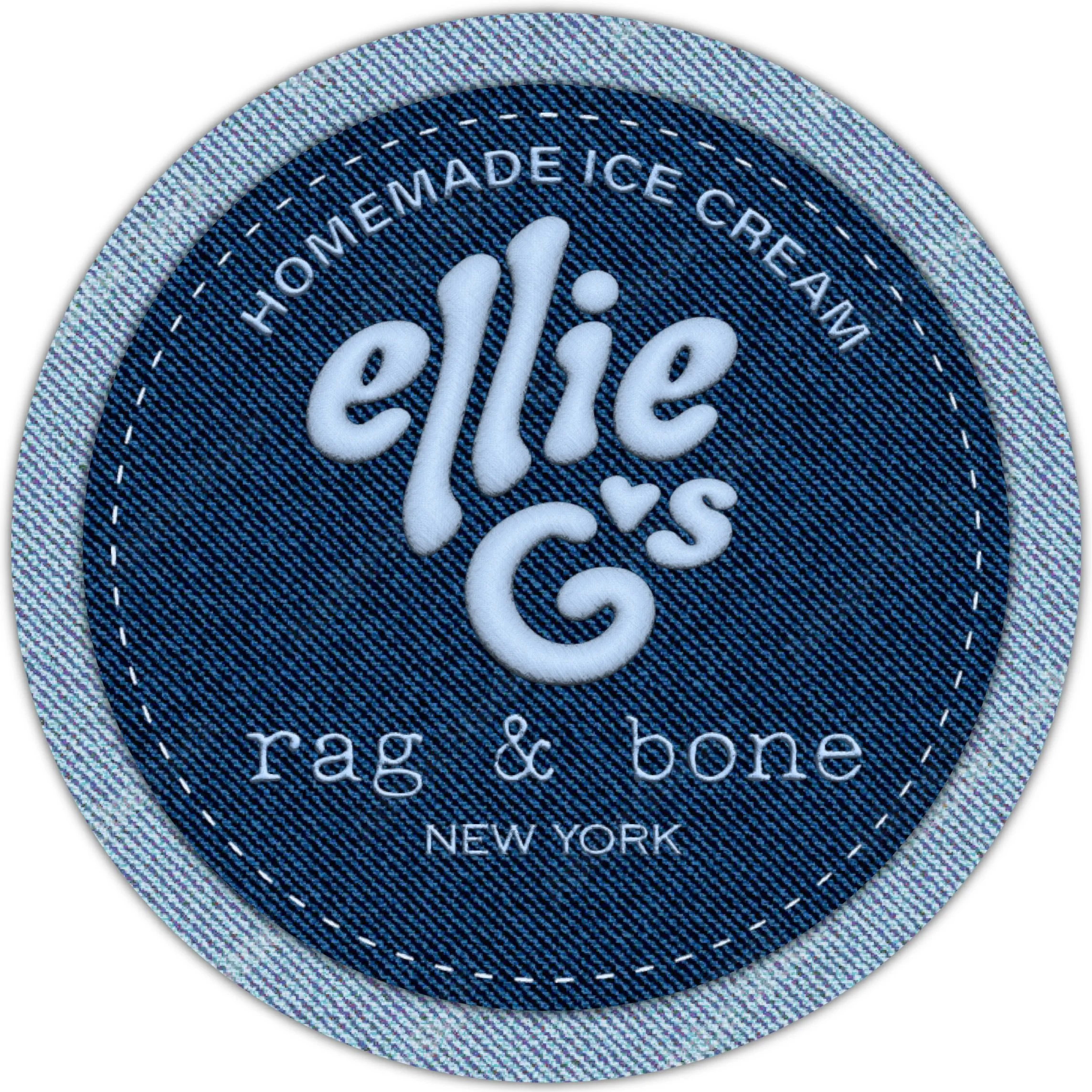
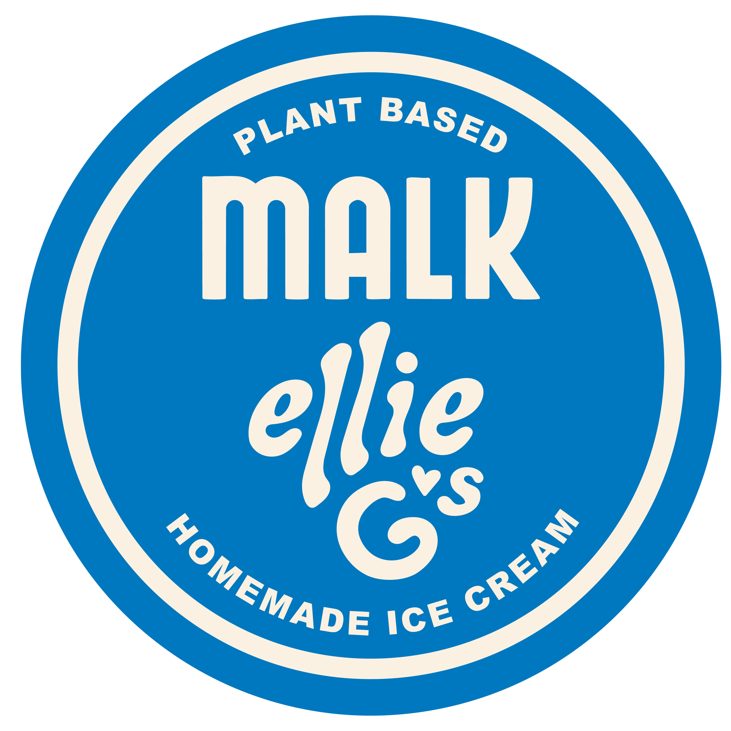
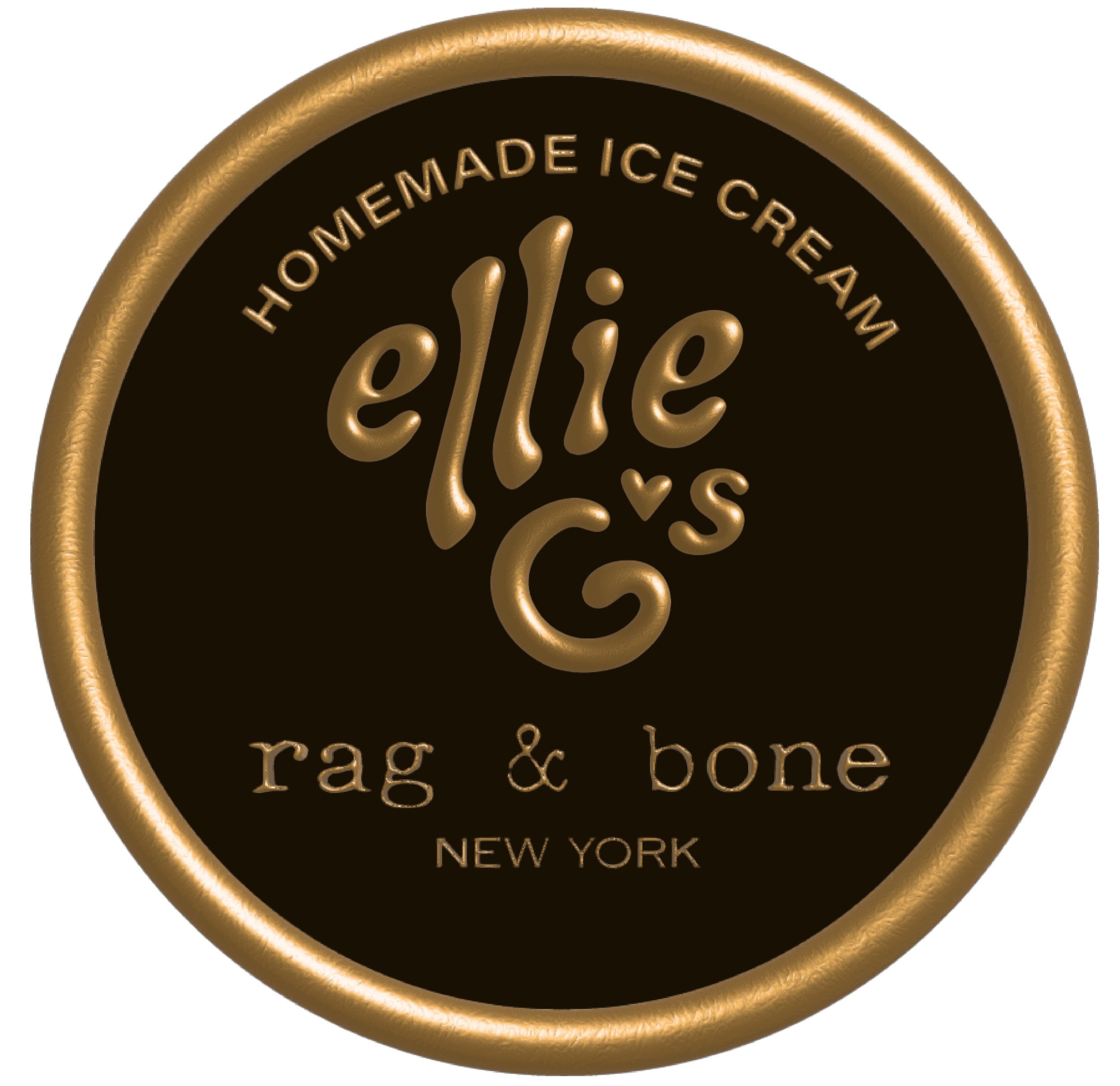
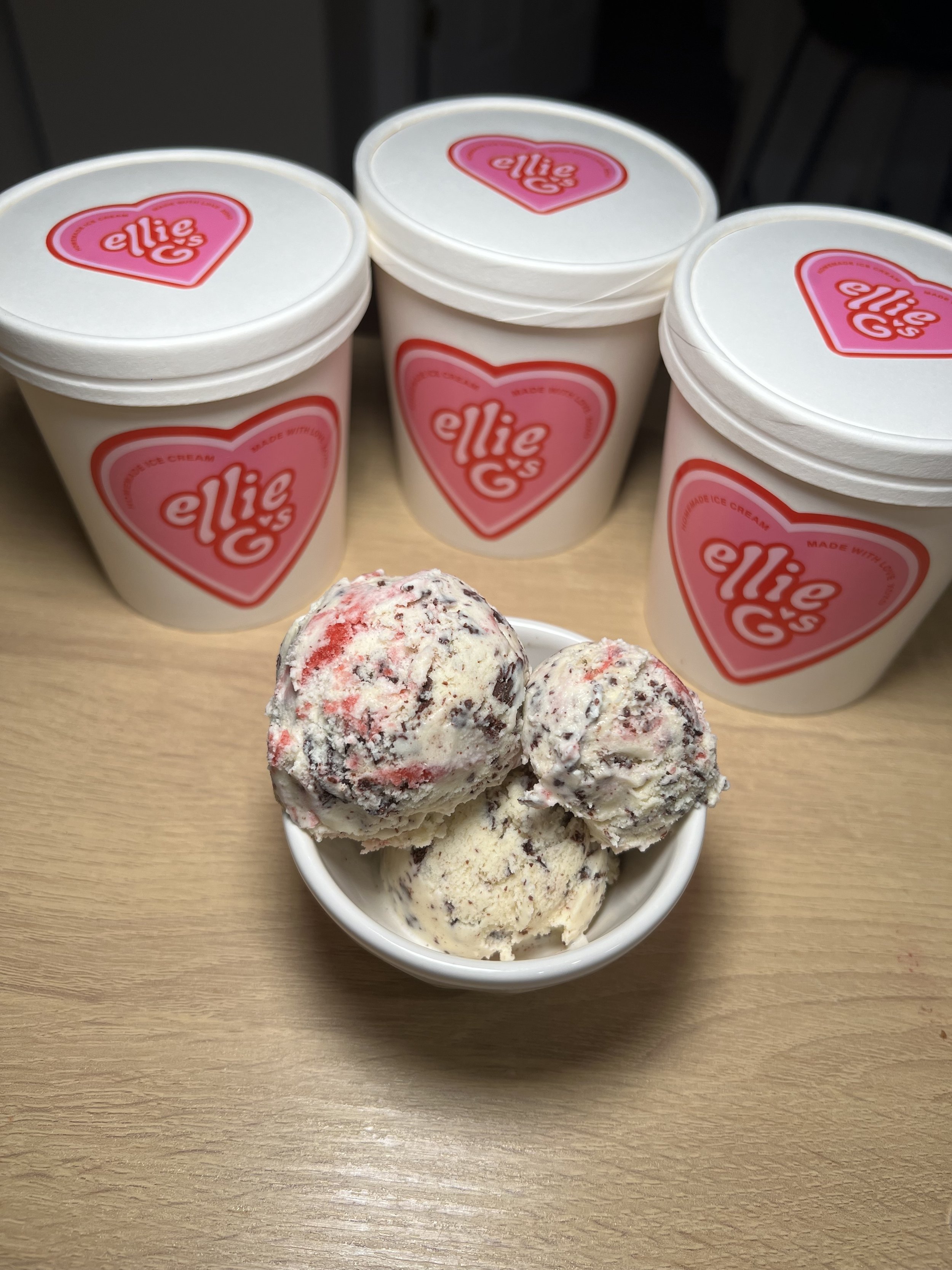
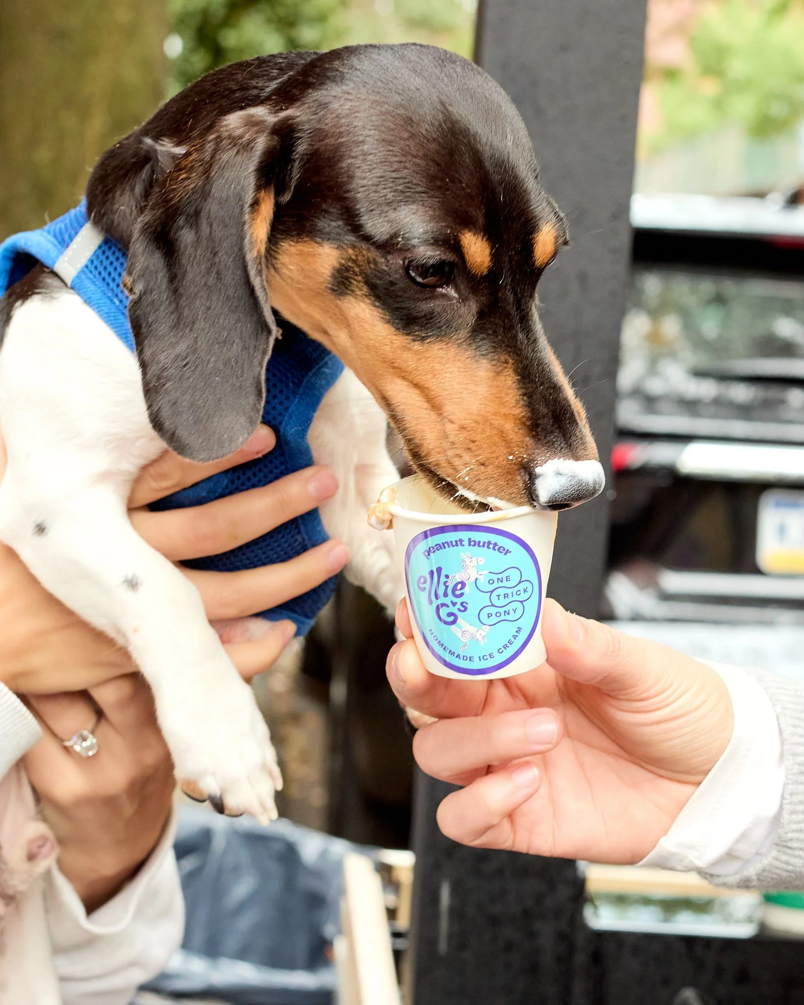
A hand-drawn typeface used to evoke a homemade feel, while a heart symbolizes both community and the heartfelt sentiment of "made with love." The outcome is a versatile, playful logotype that resonates across all age groups.

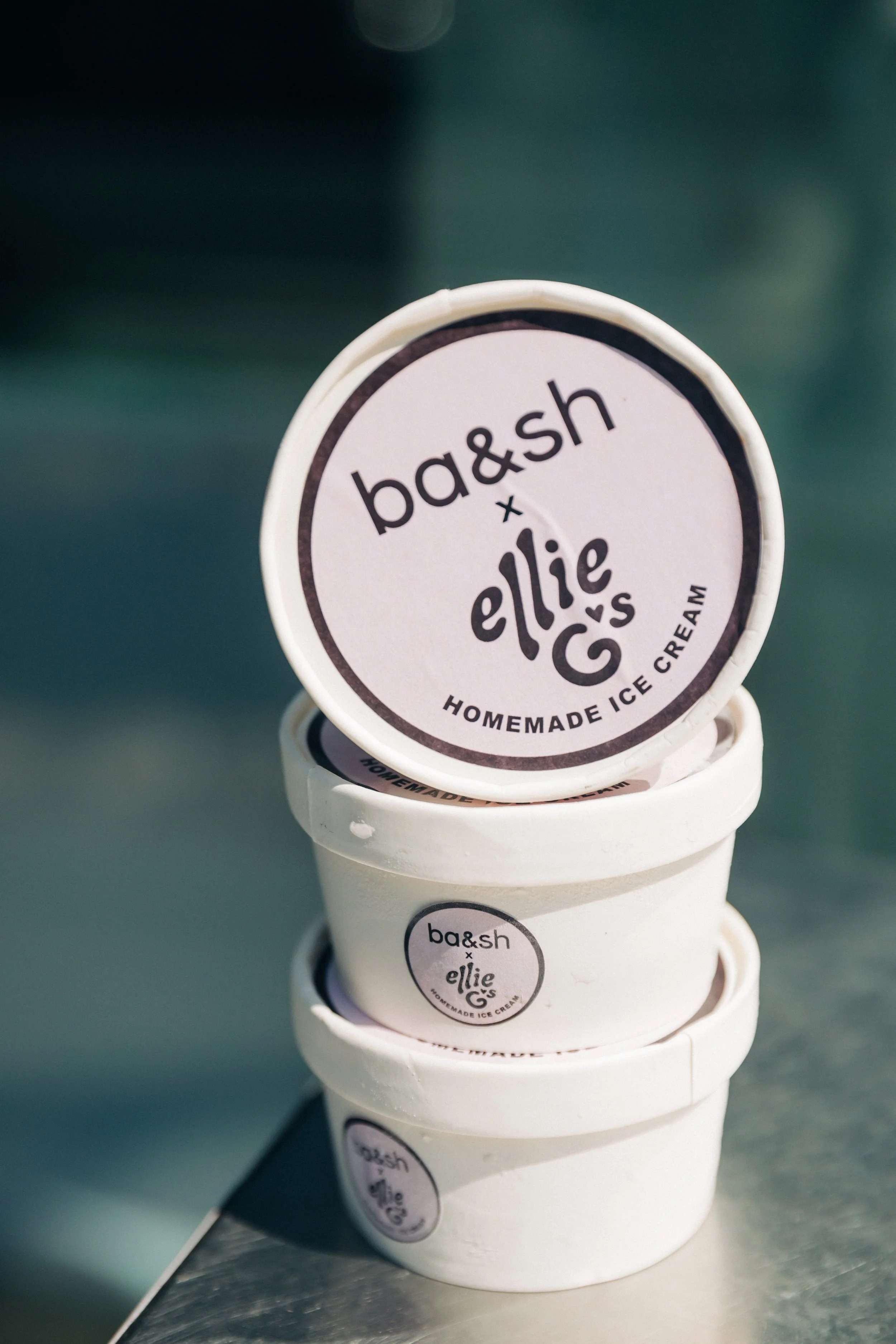
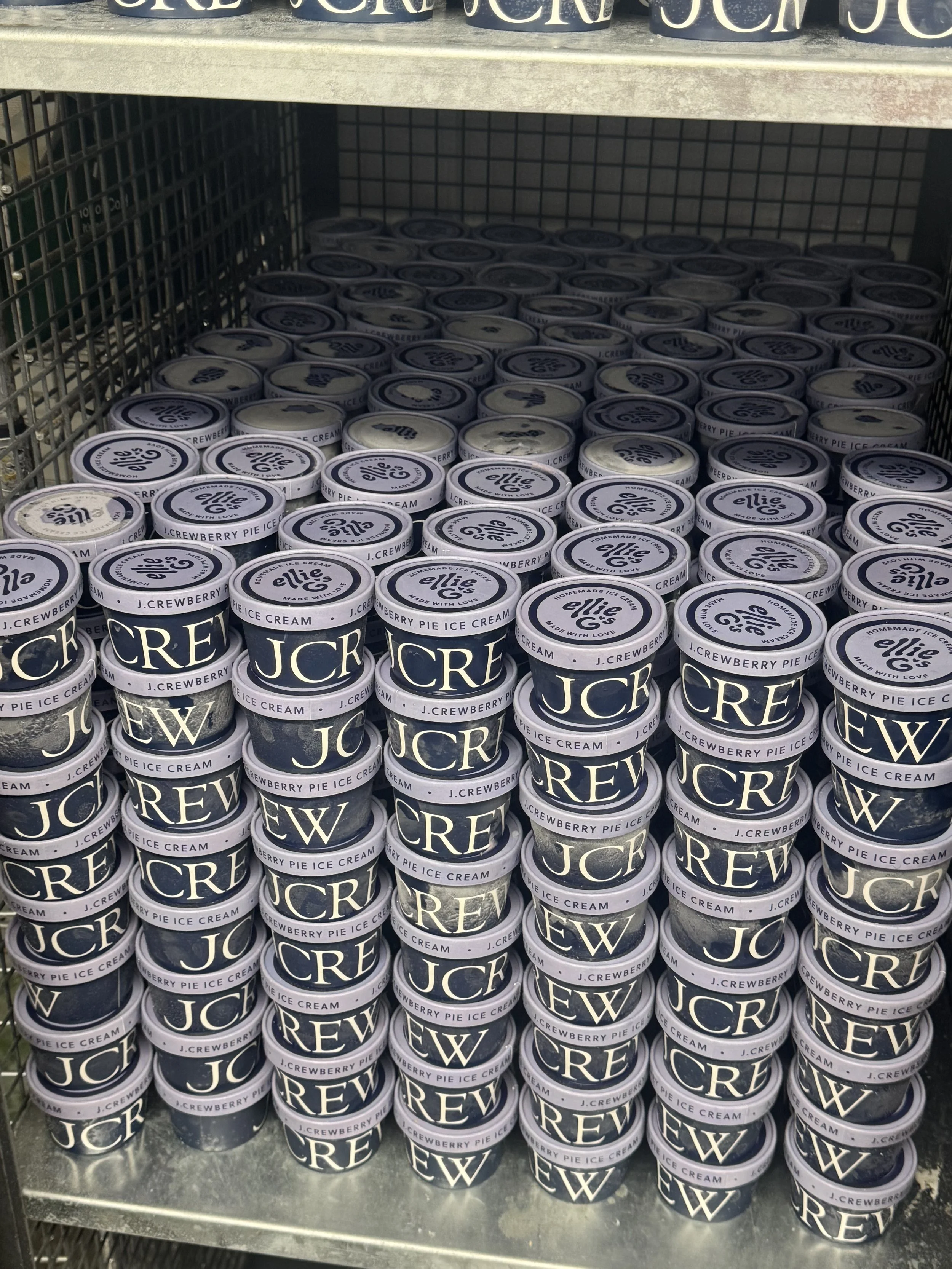
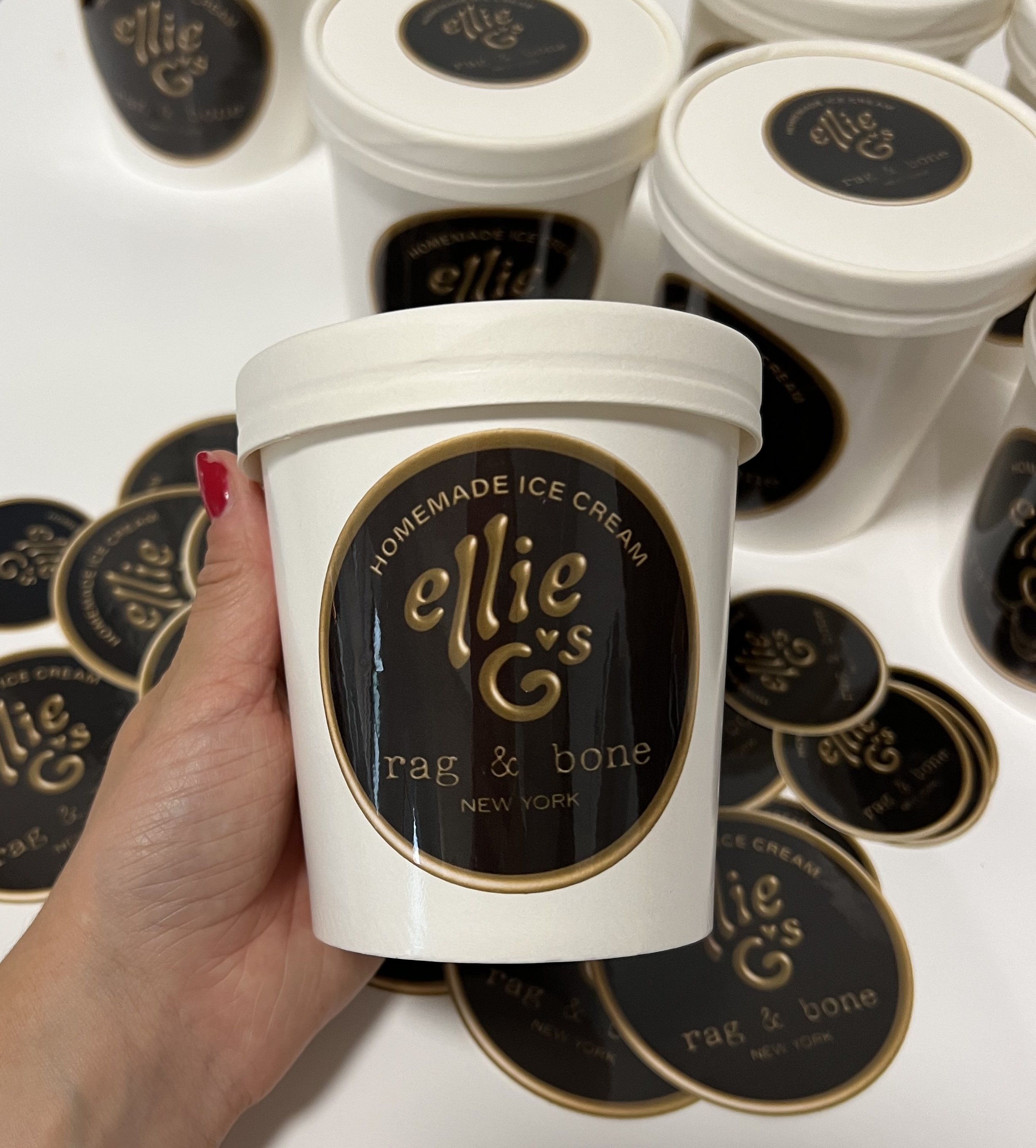
Since establishing Ellie G's new identity, the company has forged partnerships with esteemed brands like JCrew, Rag & Bone, Poppi, & more.

The countless collaboration designs showcase the versatility of the logo, seamlessly adapting to different contexts.